AI Artist & Tech Enthusiast
Seascapes Style Transfer: Complete Guide with AI Quality ...

The ocean has captivated painters for centuries -- from the luminous marine paintings of the Dutch Golden Age to Turner's storms and Hokusai's towering waves. As E.H. Gombrich noted, "The painters of seascapes not only became proficient in the painting of waves and clouds, but were such experts in the accurate portraying of ships and their tackle that their paintings are still considered valuable historical documents." Today, neural style transfer lets you transform your coastal photographs into artwork that channels these traditions -- but the results depend heavily on choosing the right style.
Seascapes present a distinctive challenge for style transfer algorithms. Their visual properties -- smooth water gradients, rhythmic wave patterns, vast unbroken horizons -- place them firmly in the low-frequency end of the image spectrum. Choosing a style that respects that frequency profile produces results that feel like genuine paintings. Choosing one that fights against it produces visual noise. This guide ranks the best art styles for seascapes based on frequency compatibility analysis, provides real before-and-after examples, and gives you practical photography tips for capturing seascapes that transfer beautifully.
Why Seascapes Photos Need the Right Art Style
Not all photographs respond to style transfer in the same way. A crowded street scene packed with signage, faces, and architectural detail is fundamentally different from an open ocean horizon, and neural networks treat them very differently.
Seascapes fall into what image processing researchers classify as low-frequency content. Spatial frequency refers to how rapidly pixel values change across an image. A photograph dense with fine edges, textures, and small objects has high spatial frequency. Seascapes are the opposite: they are dominated by smooth water gradients, gentle tonal transitions across the sky, and broad compositional sweeps. Wave patterns introduce some mid-frequency texture, but the overall character remains low-frequency compared to portraits, cityscapes, or macro photography.
This matters because neural style transfer works by separating an image's content structure from its style characteristics and recombining them. The process relies on Gram matrices that capture statistical correlations between feature channels in deep neural networks. When the frequency profile of the style image aligns with the content image, the result looks coherent. When there is a significant mismatch, artifacts emerge: water surfaces fill with distracting noise, horizon lines warp, and the stylized image looks neither like a photograph nor a convincing painting.
The key principle for seascapes style transfer is this: styles with low-to-mid frequency characteristics tend to produce the most harmonious results, because their brushwork and texture patterns complement the smooth, expansive quality of water and sky. Styles that depend on extremely fine detail or aggressive geometric patterns can overwhelm the scene's essential calm and spatial logic.
Top 5 Styles for Seascapes (Ranked)
Based on frequency compatibility analysis between each style's textural characteristics and the low-frequency profile of seascapes photography, these five styles consistently produce the strongest results. Each style is evaluated on how well its frequency signature complements the smooth gradients, broad tonal transitions, and rhythmic patterns that define ocean imagery.
| Rank | Style | Frequency Profile | Compatibility | Why It Works |
|---|---|---|---|---|
| 1 | High Renaissance | Low-mid frequency, smooth gradients | Moderate | Best frequency match: sfumato gradients naturally mirror water and atmospheric perspective |
| 2 | Baroque | Low-mid frequency, strong chiaroscuro | Moderate | Dramatic light/shadow maps perfectly onto natural ocean lighting dynamics |
| 3 | Neoclassicism | Mid frequency, smooth surfaces | Moderate | Clean surfaces and balanced composition suit expansive horizon-dominant scenes |
| 4 | Classicism | Mid frequency, structured composition | Moderate | Strong compositional framework reinforces the power of horizon lines |
| 5 | Gothic Art | Mid frequency, decorative detail | Moderate | Decorative patterning adds visual interest without overwhelming gradients |
Why High Renaissance Leads
High Renaissance painting, pioneered by Leonardo da Vinci, Raphael, and others, is defined by sfumato -- the technique of softly blending tones and colors through imperceptible gradations. This produces smooth tonal transitions that sit in almost exactly the same frequency bandwidth as a calm ocean surface. When the style transfer algorithm applies High Renaissance characteristics to a seascape, it does not need to force incompatible textures onto the water. Instead, the style's own gradients merge naturally with the content's gradients, producing results that feel organic rather than processed.
The atmospheric perspective common in High Renaissance backgrounds -- where distant elements soften and shift toward blue -- also aligns with the natural depth cues in seascape photography. Distant water, haze on the horizon, and the tonal shift between foreground waves and background sky all follow the same visual logic that Renaissance painters codified.
Why Baroque Takes Second Place
Baroque's strong chiaroscuro technique -- the dramatic interplay of light and dark -- maps exceptionally well onto seascapes. The play of sunlight on wave crests, the dark undersides of storm clouds, the contrast between illuminated foam and shadowed troughs all share Baroque's fundamental visual vocabulary. Operating in the low-to-mid frequency range, Baroque adds emotional intensity without introducing fine-grained textural noise that can damage water surfaces.
The Mid-Frequency Performers
Neoclassicism, Classicism, and Gothic Art perform well because their moderate textural detail introduces enough artistic transformation to make the stylized image feel like a painting rather than a filtered photograph, while staying close enough to the content's frequency profile to avoid distortion. Neoclassicism's emphasis on clean surfaces suits the open expanse of water. Classicism's structured composition reinforces horizon-dominant scenes. Gothic Art's decorative patterning can add stained-glass-like beauty to sky colors and wave textures.
Side-by-Side: Same Photo, Different Styles
Seeing real before-and-after examples is the most effective way to understand how style choice affects the final result. Below, we show how the same seascape photograph transforms under Van Gogh's Post-Impressionist style, demonstrating the kind of textural and chromatic changes that neural style transfer produces.
Example 1: Seascape with Van Gogh's "L'Arlesienne"
| Original Photo | Style Reference | AI Generated Result |
|---|---|---|
 |
 |
|
| Seascape photograph -- smooth water gradients and broad horizon | Vincent van Gogh, "L'Arlesienne" -- The Metropolitan Museum of Art, CC0 | Van Gogh style transfer result |
Van Gogh's characteristic swirling brushwork introduces mid-frequency texture into the water surface, transforming flat gradients into rhythmic, expressive marks. The sky gains the turbulent energy found in paintings like "Starry Night." The color palette shifts toward Van Gogh's signature saturated yellows and blues, lending the scene emotional intensity that the original photograph lacked. For a deeper exploration of this artist's style transfer, see our Van Gogh Style Transfer guide.
Example 2: Coastal Scene with Van Gogh's "Wheat Field with Cypresses"
| Original Photo | Style Reference | AI Generated Result |
|---|---|---|
 |
 |
 |
| Seascape photograph -- wave patterns and open sky | Vincent van Gogh, "Wheat Field with Cypresses" -- Met Museum, CC0 | Van Gogh style transfer result |
Using a landscape-oriented style reference, the transfer emphasizes horizontal movement. The wheat field's rolling texture maps onto the ocean surface, creating undulating wave patterns that feel painterly rather than photographic. The cypresses' dark verticals find no direct counterpart in the seascape, so the algorithm redistributes that energy into cloud formations and tonal contrasts along the horizon.
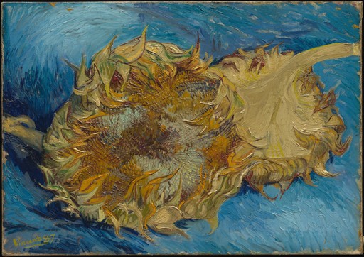
Example 3: Open Ocean with Van Gogh's "Sunflowers"
| Original Photo | Style Reference | AI Generated Result |
|---|---|---|
 |
 |
 |
| Seascape photograph -- vast expanse with minimal detail | Vincent van Gogh, "Sunflowers" -- Met Museum, CC0 | Van Gogh style transfer result |
The Sunflowers reference pushes the palette into warm amber and golden tones -- an unexpected but visually striking treatment for a seascape. The thick impasto brushwork translates into bold textural marks across the water surface, demonstrating how a dramatically different style reference can produce creative results that go beyond enhancement into genuine artistic reinterpretation.
Challenging Styles for Seascapes (and What to Watch For)
While no art styles are categorically incompatible with seascapes, frequency analysis identifies several categories that require careful handling to avoid suboptimal results.
High-frequency, detail-intensive styles present the greatest risk. Styles characterized by microscopic detail, dense cross-hatching, or aggressive textural patterning create a fundamental mismatch with seascapes' smooth gradients. When the algorithm imposes high-frequency texture onto low-frequency water, the result resembles static rather than coherent artistic interpretation -- the algorithm finds no meaningful edges to anchor the fine detail, so texture distributes randomly, destroying fluid continuity.
The Northern Renaissance style, for instance, tends toward extremely fine rendering -- think Jan van Eyck's photographic precision. It works more naturally with content that already has rich, detailed surfaces: textiles, architecture, botanical subjects. With seascapes, results can be impressive when the photo includes detailed foreground elements (rocky coastlines, boat rigging), but may feel forced on open water with minimal surface detail. Similarly, Rococo operates in the high-frequency, delicate detail band -- its ornate quality does not always align with water's essential smoothness.
Styles with strong geometric patterns can also struggle with seascapes. The ocean is fundamentally organic -- curves, swells, irregular foam patterns. A style that imposes rigid geometric structure may conflict with this organic quality, producing images that feel forced rather than natural.
The practical takeaway: when selecting a style for seascapes, bias toward styles in the low-to-mid frequency range. If you want more visual drama, increase it through lighting contrast (Baroque) or compositional structure (Classicism) rather than through textural density. And if you want to experiment with higher-frequency styles, choose seascape photos that include detailed foreground elements to give the algorithm surface complexity to work with.
Photography Tips for Better Seascapes Style Transfer
The quality of your style transfer output depends significantly on the input photograph. These guidelines will help you capture seascapes that transform effectively.
Shoot during golden hour or blue hour. Both produce strong tonal gradients that give the algorithm clear structure to work with. Harsh midday light flattens the ocean into a uniform surface with little variation. As documented in Art Through the Ages, "The sea, especially by moonlight, was a favorite subject" -- artists understood that dramatic lighting elevates marine scenes.
Include a clear horizon line. As observed in History of Art, even minimalist compositions rely on "a few perfectly placed blobs and lines of jet-black ink" to "conjure up a boat and also the expanse of still water on which it floats." A clean, unobstructed horizon gives the composition a strong anchor that the algorithm preserves effectively.
Add a focal point. A lone boat, a lighthouse, a rocky outcrop -- these elements introduce mid-frequency content that gives the algorithm something to articulate. Historical marine painters intuitively applied this, using "meticulous and defining drawing" for ships while employing broader treatment for surrounding water -- a dual-frequency approach that style transfer algorithms naturally replicate.
Use long exposures for smoother water. Silky, blurred water creates an even lower frequency profile that pairs exceptionally well with High Renaissance and Baroque styles. The smooth water becomes an ideal canvas for painterly brushwork.
Capture cloud structure. Dramatic clouds add mid-frequency detail to the sky. As Art Through the Ages describes, Ryder's moonlit marines featured "the bold, and almost animate, pattern of the lunar sky" -- interesting clouds give the algorithm more to work with, and the stylized sky often becomes the most compelling part of the image.
Avoid overcrowded compositions. A frame filled with swimmers and beach chairs is effectively a high-frequency image that happens to contain water. Simplify the composition for the best results with recommended styles.
Favor underexposed over overexposed. Blown-out highlights contain zero gradient information. Slightly underexposed images retain the tonal range needed for rich style transfer results.
How to Apply (3 Steps)
Transforming your seascape photograph into a stylized artwork takes under a minute:
-
Upload your seascape photo at ArtRobot.ai -- any resolution, JPG or PNG. No account required for your first transformations.
-
Choose your style from the ranked recommendations above. Start with High Renaissance or Baroque for the most natural results. For more experimental outcomes, try Gothic Art or Van Gogh. You can also browse by art movement to discover styles you had not considered.
-
Download your stylized seascape in up to 4K resolution. Compare multiple style treatments of the same photo to find your preferred aesthetic.
For additional style transfer options and higher resolution outputs, explore the available plans at ArtRobot.ai.
FAQ
What is the best art style for seascapes photography?
High Renaissance consistently produces the most natural seascapes style transfer results. Its low-to-mid frequency profile -- characterized by smooth gradients and atmospheric perspective (sfumato) -- closely matches the frequency characteristics of seascape photography: smooth water, broad sky tones, and gentle tonal transitions. Baroque is the strongest alternative, particularly for seascapes with dramatic lighting, because its chiaroscuro technique maps naturally onto the contrast between illuminated wave crests and shadowed troughs. For a comprehensive ranking, see our guide to the best art styles for seascapes.
Why do some art styles work better for seascapes photos?
The answer lies in spatial frequency compatibility. Seascapes are predominantly low-frequency images -- smooth gradients, minimal fine detail, broad tonal sweeps. Styles that operate in the low-to-mid frequency range produce coherent results because the algorithm can align statistical distributions without forcing incompatible textures onto smooth surfaces. High-frequency styles with dense detail create a mismatch that manifests as visual noise, particularly across open water where there are no edges to anchor fine detail.
How do I choose the right style for my seascapes photo?
Consider your photo's lighting, detail level, and desired mood. For calm, evenly lit seascapes, High Renaissance or Neoclassicism provide elegant transformations. For dramatic lighting (golden hour, storms, moonlight), Baroque excels. For seascapes with focal points like boats or lighthouses, Classicism or Gothic Art add more articulation. If unsure, start with High Renaissance -- it has the broadest compatibility. See also the landscapes style transfer guide for comparison.
What seascapes photos produce the best style transfer results?
Photos with clear compositional structure: a defined horizon line, good tonal range, and at least one focal element beyond the water. Long-exposure seascapes with silky water work particularly well, as they maximize low-frequency content. Golden hour lighting adds tonal depth for richer results. Avoid overcrowded beach scenes and overexposed images where blown-out highlights carry no gradient data. For deeper analysis, see the Seascapes Early Renaissance Photo Effect guide.
Can I apply multiple art styles to the same seascapes photo?
Yes, and it is one of the best ways to understand how style transfer works. Applying High Renaissance, Baroque, and Gothic Art to the same seascape reveals how each style's frequency profile interacts differently with identical content. The water renders smoothly under High Renaissance, gains dramatic shadows under Baroque, and develops decorative patterning under Gothic Art. Try all available styles at ArtRobot.ai to compare results side by side.
Try It Yourself
Transform your own photos into stunning paintings with 80+ artist styles. Free to start.