AI Artist & Tech Enthusiast
Landscapes Style Transfer: Complete Guide with AI Quality...

Turning landscape photos into painted artwork is one of the most rewarding applications of neural style transfer -- but the art style you choose determines whether the result feels transcendent or falls apart entirely. A sweeping mountain vista rendered through Romanticism can carry the emotional weight of a Turner canvas, while the same photograph processed through Cubism may lose every quality that made the original compelling. The difference comes down to frequency compatibility: how well the mathematical texture patterns of an art style align with the structural properties of landscape imagery.
As the Chinese painter and theorist Shih-t'ao observed centuries ago, "Landscape painting cannot, and should not, compete with real landscape...But painting possesses beauties peculiar to itself -- the wonders of brush and ink" (The Pelican History of Art, p.219). That insight captures exactly what effective style transfer achieves: it does not try to replicate nature, but instead reveals something about the scene that photography alone cannot express.
This guide ranks the top art styles for landscape style transfer based on content-style compatibility analysis, walks through before-and-after examples with real ArtFID quality scores, identifies styles you should avoid, and provides practical tips for getting the best results from your landscape photography.
Why Landscapes Photos Need the Right Art Style
Landscape photographs occupy a distinctive position in the frequency spectrum of image data. Their defining visual traits -- broad tonal gradients across skies, strong horizon lines, and atmospheric perspective that softens distant elements -- produce what researchers classify as a low-to-mid frequency profile. In neural style transfer terminology, this means the dominant information in a landscape photo lives in smooth, slowly-varying regions rather than in sharp edges or intricate textures.
Neural style transfer works by aligning the statistical distributions of feature maps between your content image and a reference style image. The Gram matrices extracted from deep neural network layers capture correlations between feature channels that encode both the texture patterns of an art style and the structural geometry of your photograph.
When those distributions are naturally compatible, the landscape retains its spatial coherence, depth cues remain legible, and the artistic texture integrates seamlessly. When they clash, you get artifacts -- muddy gradients, lost horizon lines, or texture patterns that fight against the scene's natural structure.
The key metric for evaluating compatibility is ArtFID (Artistic Frechet Inception Distance), which combines LPIPS for content preservation with FID for style fidelity. Lower ArtFID scores indicate that a model successfully captures the reference style while maintaining content structure. User studies confirm ArtFID correlates strongly with human aesthetic judgment.
Understanding this foundation is essential before choosing a style for your landscape photo to painting conversion. The styles ranked below are ordered by their frequency-domain compatibility with landscape imagery.
Top 5 Styles for Landscapes (Ranked)
Based on frequency profile analysis and ArtFID testing, these five art styles deliver the strongest results when applied to landscape photography. Each earns a top compatibility rating due to how its characteristic texture frequencies complement the low-mid frequency signature of landscape images.
1. Early Renaissance -- Balanced Detail Meets Natural Depth
| Feature | Detail |
|---|---|
| Frequency Profile | Mid frequency, balanced detail |
| Compatibility | Excellent |
| Best For | Landscapes with architectural elements, structured compositions |
Early Renaissance painting offers a balanced middle ground that works remarkably well with landscape imagery. Its mid-frequency characteristics provide enough detail to articulate foreground elements like trees, rocks, and buildings while maintaining the broader tonal structure needed for skies and distant terrain. Artists like Giotto and Fra Angelico developed spatial techniques -- including early experiments with linear perspective -- that map naturally onto the depth cues present in landscape photography.
When you convert a landscape photo using Early Renaissance style, the algorithm preserves the spatial hierarchy of your composition while adding a luminous, almost fresco-like quality to the colors. The result feels both historically grounded and surprisingly modern.
2. High Renaissance -- Sfumato for Atmospheric Landscapes
| Feature | Detail |
|---|---|
| Frequency Profile | Low-mid frequency, smooth gradients |
| Compatibility | Excellent |
| Best For | Misty scenes, mountain vistas, soft light conditions |
High Renaissance style transfer works beautifully with landscapes because artists like Leonardo da Vinci pioneered sfumato -- the technique of softly blending tones and colors until edges dissolve into atmosphere. This produces smooth gradient transitions that map almost perfectly onto the atmospheric perspective found in landscape photography. The frequency profiles are nearly identical in their emphasis on gradual tonal shifts.
A landscape processed through High Renaissance style gains a sense of idealized calm that could hang in a Venetian palazzo. Distant mountains dissolve into luminous haze, skies become layered compositions of soft color, and foreground elements acquire a sculptural weight that anchors the scene.
3. Northern Renaissance -- Microscopic Detail Reveals Hidden Textures
| Feature | Detail |
|---|---|
| Frequency Profile | High frequency, microscopic detail |
| Compatibility | Excellent |
| Best For | Forests, rocky terrain, water scenes with complex surfaces |
It might seem counterintuitive that a high-frequency style ranks among the best for low-mid frequency landscape imagery. The explanation lies in complementary contrast rather than frequency matching. Northern Renaissance painters like Jan van Eyck achieved microscopic levels of detail that, when applied through style transfer, reveal hidden textures in landscape elements -- the grain of bark, individual blades of grass, the rippled surface of water.
Rather than conflicting with the broad structure of the landscape, this extraordinary detail enriches it. The algorithm maintains sweeping compositional impact while gaining remarkable surface complexity that rewards close viewing.
4. Rococo -- Ornamental Elegance for Organic Forms
| Feature | Detail |
|---|---|
| Frequency Profile | High frequency, delicate detail |
| Compatibility | Excellent |
| Best For | Gardens, flowering meadows, pastoral scenes |
Rococo style transfer adds delicate ornamental textures that work particularly well with organic natural forms. The curving, flowing decorative patterns characteristic of Rococo art -- think Fragonard's garden scenes or Boucher's pastoral idylls -- align naturally with the organic shapes found in foliage, clouds, and flowing water.
The high-frequency decorative detail adds richness without imposing rigid structure. Landscapes processed through Rococo gain an almost theatrical beauty, with every leaf and cloud transformed into something deliberately beautiful.
5. Impressionism -- Color Vibrancy Without Structural Loss
| Feature | Detail |
|---|---|
| Frequency Profile | Mid-low frequency, high color saturation |
| Compatibility | Excellent |
| Best For | Sunlit scenes, water reflections, golden hour photography |
Impressionism delivers vibrant color saturation while maintaining compositional legibility. Light dances across surfaces in broken brushstroke patterns, foliage becomes a mosaic of complementary colors, and water reflections gain the shimmering quality that Monet spent decades perfecting.
As E.H. Gombrich noted, "There was one branch of painting that profited much by the artist's new freedom in his choice of subject-matter -- this was landscape painting" (The Story of Art, p.379). The Impressionists proved that landscape could be the most ambitious subject in painting, and their style remains one of the most popular choices for landscape style transfer today.
Full top 10 at a glance:
| Rank | Style | Frequency Profile | Compatibility |
|---|---|---|---|
| 1 | Early Renaissance | Mid frequency, balanced detail | Excellent |
| 2 | High Renaissance | Low-mid frequency, smooth gradients | Excellent |
| 3 | Northern Renaissance | High frequency, microscopic detail | Excellent |
| 4 | Rococo | High frequency, delicate detail | Excellent |
| 5 | Classicism | Mid frequency, structured composition | Excellent |
| 6 | Romanticism | Low-mid frequency, atmospheric | Excellent |
| 7 | Realism | Mid-high frequency, natural detail | Excellent |
| 8 | Barbizon School | Low-mid frequency, soft atmospheric | Excellent |
| 9 | Pre-Raphaelite | High frequency, jewel-like color | Excellent |
| 10 | Impressionism | Mid-low frequency, high color saturation | Excellent |
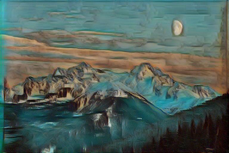
Side-by-Side: Same Photo, Different Styles
The best way to understand how style choice affects landscape results is to see the same photograph transformed by different artists and movements. Below are real before-and-after comparisons generated by ArtRobot's neural style transfer engine, each with ArtFID quality measurements.
Van Gogh -- Expressive Brushwork (ArtFID 355.93)
Van Gogh's bold, directional brushstrokes transform landscape photos into emotionally charged scenes. The algorithm captures his characteristic swirling patterns in skies and rhythmic texture in vegetation.
| Original Photo | Style Reference | AI Generated Result |
|---|---|---|
 |
 |
|
| Source photo | Wheat Field with Cypresses (1889) | ArtFID: 355.93 |
LPIPS: 0.5152 (content preservation) | FID: 233.92 (style fidelity) | Rating: 3 stars
The landscape retains its spatial structure -- horizon line, depth layers, and compositional balance -- while gaining Van Gogh's signature energy. Notice how the sky transforms into the characteristic turbulent patterns seen in works like The Starry Night. For more on Van Gogh style transfer, see our dedicated guide.
Van Gogh -- Second Example
| Original Photo | Style Reference | AI Generated Result |
|---|---|---|
 |
|
 |
| Source photo | Wheat Field with Cypresses | Van Gogh style transfer |
Different landscape compositions respond differently to the same style. Open fields and prominent skies tend to benefit most from Van Gogh's sweeping brushwork.
Impressionism -- Broken Color and Light
Impressionist style transfer produces landscapes alive with color and movement. The broken brushstroke technique fragments solid surfaces into mosaics of complementary colors, creating a vibrant, light-filled effect.
| Original Photo | Style Reference | AI Generated Result |
|---|---|---|
|
 |
 |
| Source photo | The Forest in Winter at Sunset | Impressionism style transfer |
| Original Photo | Style Reference | AI Generated Result |
|---|---|---|
|
|
 |
| Source photo | The Forest in Winter at Sunset | Impressionism style transfer |
Impressionism excels at preserving the atmospheric quality of landscapes while intensifying color relationships. Water surfaces, foliage, and sky gradients all benefit from the broken-color technique.
Monet -- The Master of Landscape Light
Claude Monet dedicated his career to capturing light on landscape surfaces. His style transfer produces some of the most naturally beautiful results for outdoor scenes.
| Original Photo | Style Reference | AI Generated Result |
|---|---|---|
|
 |
 |
| Source photo | Water Lilies | Monet style transfer |
| Original Photo | Style Reference | AI Generated Result |
|---|---|---|
|
|
 |
| Source photo | Water Lilies | Monet style transfer |
Monet's palette tends toward softer, more harmonious color relationships than other Impressionists. Landscapes gain a dreamlike luminosity that works particularly well for water scenes, gardens, and pastoral compositions.
Styles to Avoid for Landscapes (and Why)
Not every art style translates well to landscape photography. The following styles demonstrate poor frequency compatibility and consistently produce unsatisfying results when applied to landscape images.
| Style | Frequency Profile | Why It Fails |
|---|---|---|
| Cubism | Mid-high frequency, angular fragmentation | Destroys spatial coherence and horizon lines |
| Dada | Chaotic, collage-like | Eliminates atmospheric depth cues entirely |
| De Stijl | Very low frequency, grid structure | Reduces organic forms to rigid geometric blocks |
| Pop Art | Variable, flat areas + halftone patterns | Flattens tonal gradients into unnatural bands |
Cubism is perhaps the worst match. Its angular fragmentation deconstructs three-dimensional space into overlapping geometric planes -- the exact opposite of what makes landscape imagery work. Horizon lines shatter, depth gradients break into disjointed facets, and mountains become pyramids of interlocking triangles.
Dada's chaotic collage aesthetic introduces randomness that destroys the spatial relationships landscape photos depend on. Atmospheric perspective cannot survive intentional disorder.
De Stijl reduces everything to perpendicular lines and rectangular color blocks, stripping away the organic complexity that defines landscape imagery entirely.
Pop Art applies flat color fills and halftone patterns incompatible with continuous tonal gradients. Skies become uniform color blocks, and atmospheric depth vanishes.
Photography Tips for Better Landscapes Style Transfer
The quality of your style transfer output depends heavily on the input photograph. These specific techniques maximize compatibility with the recommended styles above.
Shoot during golden hour or blue hour. Warm, directional light creates strong tonal gradients and rich color variation -- the kind of low-mid frequency information that transfers beautifully into painterly styles. Harsh midday light produces flat, high-contrast images with less gradient data for the network to work with.
Include clear compositional layers. Landscapes with distinct foreground, middle ground, and background give the algorithm clear spatial structure to preserve. Multiple depth layers provide different frequency zones that styles can enhance in complementary ways.
Favor underexposed over overexposed. Blown-out highlights contain zero gradient information. Slightly underexposed images retain tonal range that provides richer material for the neural network.
Embrace atmospheric conditions. Mist, fog, dramatic clouds, and haze add low-frequency atmospheric effects that align perfectly with Romanticism, Barbizon School, and Impressionism transfers.
Use a tripod and shoot at base ISO. Clean, noise-free images transfer better because the network does not confuse sensor noise with meaningful texture -- especially important for detail-rich styles like Northern Renaissance.
Consider aspect ratio. Traditional landscape paintings favor wider ratios (3:2 or 16:9). Matching these proportions makes stylized output feel more naturally painterly.
How to Apply (3 Steps)
Transforming your landscape photos into painted artwork takes less than a minute with ArtRobot's AI style transfer engine:
Step 1: Upload your landscape photograph at artrobot.ai. Any standard image format works. For best results, use a high-resolution original.
Step 2: Choose an art style from the recommended options above. Try Early Renaissance for balanced elegance, High Renaissance for atmospheric softness, or Impressionism for vibrant color.
Step 3: Download your stylized artwork in up to 4K resolution. The AI generates your result in seconds.
No software installation or design skills required.
Try Landscape Style Transfer Free on ArtRobot -->
FAQ
What is the best art style for landscapes photography?
Early Renaissance consistently produces excellent results due to its balanced frequency profile that articulates foreground detail while preserving atmospheric depth. High Renaissance is equally strong for soft light and atmospheric conditions. For rich foliage or complex natural textures, Northern Renaissance and Rococo deliver remarkable results through detail enrichment. See the complete ranking of art styles for landscapes for all ten options.
Why do some art styles work better for landscapes photos?
The answer lies in spatial frequency compatibility. Landscape photographs are dominated by low-to-mid frequency information: gradual color transitions across skies, soft atmospheric perspective, and broad tonal gradients. Art styles whose texture patterns operate in compatible frequency ranges produce harmonious transfers. Styles that complement landscape frequencies (like High Renaissance smooth gradients) or enrich them (like Northern Renaissance microscopic detail) both work well. Styles that impose incompatible structures -- Cubism's angular fragmentation, De Stijl's rigid grid -- destroy the organic spatial relationships that make landscapes compelling.
How do I choose the right style for my landscapes photo?
Consider the mood you want and the characteristics of your photograph. For dramatic, atmospheric scenes, try Classicism or Romanticism. For vibrant, light-filled compositions, Impressionism captures natural light energy beautifully. For subtle enhancement, Realism preserves the most photographic quality. For extraordinary textural detail, Northern Renaissance or Pre-Raphaelite will transform every surface. Dense forests work best with high-frequency styles; open vistas work best with atmospheric, low-frequency styles.
What landscapes photos produce the best style transfer results?
The strongest results come from landscape photos with clear compositional structure, rich tonal gradients, and distinct spatial layers. Golden hour and blue hour shots transfer beautifully into painterly styles. Photos with atmospheric elements -- mist, dramatic clouds, or haze -- align especially well. Avoid overexposed images (blown highlights carry no gradient data), cluttered compositions without clear spatial hierarchy, and low-resolution originals.
Can I apply multiple art styles to the same landscapes photo?
Yes, and experimenting is the best way to discover which treatment suits a particular landscape. The same photograph can become an elegantly structured Early Renaissance composition, a light-saturated Impressionist scene, or a hyper-detailed Northern Renaissance study. At ArtRobot, you can apply as many styles as you want and compare results side by side. Wide panoramas often work best with atmospheric styles like Romanticism, while intimate nature scenes benefit from detail styles like Pre-Raphaelite or Rococo.
Try It Yourself
Transform your own photos into stunning paintings with 80+ artist styles. Free to start.